At the end of January, year-end inventory results reach head office and, in many retail networks, the same table starts circulating: a column of stores, a column of shrinkage rates, sorted from worst to best. Within seconds, everyone knows who is "last". But this ranking often reflects the way stores count as much as the losses themselves. To compare shrinkage from one store to another without aiming at the wrong target, you first need to make all sites count in the same way. The choice of denominators comes next. Finally, reading the figures by zone and time slot is what makes the gaps actionable in store.
Why a raw store ranking is misleading
The most widely used shrinkage rate relates the value of inventory variances to revenue. While it is a good indicator of overall health, it is a poor ranking tool, because it depends first and foremost on what each store includes in the calculation. In his report Beyond Shrinkage: Introducing Total Retail Loss, Professor Adrian Beck (University of Leicester) points out that the lack of a common definition makes shrinkage data very difficult to compare: some companies only count unexplained variances, while others add breakage, expiry or process errors.
What holds true between retail brands also holds true between the stores of a single network. The same biases come back year after year:
- The inventory calendar: a store counted just after the sales and another counted before them are not describing the same period.
- Poorly reported known shrinkage: every carton of breakage that is not recorded automatically falls into unknown shrinkage and inflates its rate.
- Upstream errors: an incomplete delivery, a badly checked receipt or a forgotten transfer between sites show up in store as losses.
- The size effect: in a small store, three or four expensive items are enough to make the rate jump from one year to the next.
- The product mix: a store that sells more highly exposed items logically shows a higher rate.
The store at the bottom of the ranking is therefore not necessarily the worst-run one. Sometimes it is simply the smallest. Or the one that takes inventory most rigorously, or the one that inherits the most problematic deliveries from the warehouse.
Harmonize measurement before any comparison
Standardizing figures that do not measure the same thing is pointless. The study Measuring Retail Shrink, published by ECR Retail Loss, makes the point: to compare shrinkage rates, you need to know how they are calculated, apply the method consistently, and remain cautious when shrinkage is valued differently. Its authors, drawing on a 2004 survey of retailers operating in Europe, also note that supply chain losses, which are rarely measured, are very likely to be attributed to stores and to inflate their shrinkage. Most respondents at the time measured their shrinkage only twice a year; the study recommends counting as often as possible, in order to react to emerging trends.
In a network, this translates into a written rulebook applied everywhere. It sets the exact scope of unknown shrinkage and the valuation method (retail price or purchase price, but the same across all sites, and ideally both). It aligns inventory dates and enforces identical treatment of receiving variances. If these foundations are still missing, our guide to understanding, calculating and reducing unknown shrinkage covers the basics of the calculation. The work is thankless, but everything else depends on it.
Normalize by revenue, footfall and floor area
Once measurement is harmonized, the choice of denominator remains. Each one sheds light on a different aspect, and none is enough on its own.
- By revenue: this is the classic shrinkage rate, the one that can be compared with market benchmarks. According to the NRF's 2023 National Retail Security Survey, the average shrinkage rate of the American retailers surveyed rose to 1.6% in fiscal year 2022, up from 1.4% the previous year, returning to the level of 2019 and 2020. Its limitation is well known: a store with high revenue dilutes its losses, and a major promotional campaign (or an increase in selling prices, when shrinkage is valued at purchase price) shifts the ratio without anything changing on the shelves.
- By footfall: loss per thousand visitors. This neutralizes differences in average basket size so that you can compare stores whose aisles see comparable traffic. It still requires reliable, consistent counting across the whole network.
- By floor area: loss per square meter, or better, per linear meter of a given product category. This view is used to compare exposure density and the quality of the layout, especially between similar formats.
Let's take a fictional, deliberately simplified case. Store A, in a city centre, sees a lot of people pass through with small baskets. Store B, on the outskirts, receives fewer visitors, but its baskets are large enough for it to generate higher revenue. Over the year, both lose the same value of merchandise. Relative to revenue, B looks better; relative to footfall, A loses the least per visitor. Neither figure is "the right one." It is their divergence that guides the analysis: towards exposure to foot traffic for A, towards high-value items for B.
One last habit to adopt: compare each store to its peers (same format, same type of location, similar size) and to its own history over several inventories, rather than to the average of the whole network.
Reading the statistics by zone and time slot
An annual rate, even a well-normalized one, tells you neither where nor when losses occur. Two stores with the same rate can be in opposite situations. In one, variances are concentrated in the perfumery section between 5 and 7 pm; in the other, they are spread across the whole sales floor on Saturdays. These two situations are not handled with the same action plan.
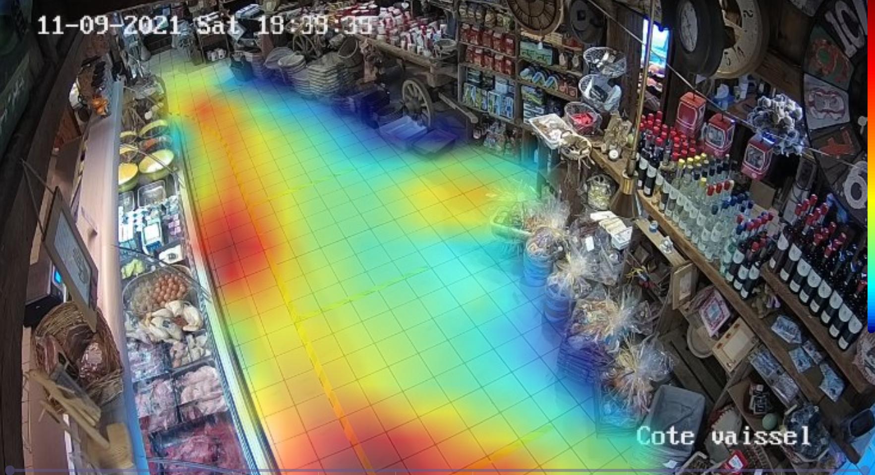
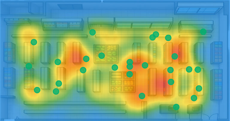
This is where camera data takes over from inventory. Video analytics dashboards, such as Oxania's, bring together visitor counting, heatmaps and statistics by zone and time slot. They do not replace inventory, which remains the measure of actual loss, but they arrive continuously rather than once or twice a year. Mapping at-risk gestures by zone then provides a basis for comparing equivalent aisles from one store to another.
One caution, however: the number of alerts also depends on what the cameras see. A store whose exposed aisles are well covered will report more events than a store riddled with blind spots, without being any more affected. To compare, relate alerts to the footfall of the zone and check that camera coverage is equivalent from one site to another. Otherwise, it is the best-equipped store that ends up penalized.
Replace the ranking with a comparison that helps decisions
A 1-to-N ranking circulated across the whole network produces a perverse effect well known to management controllers: people end up polishing the indicator rather than the reality. Breakage is declared with sudden zeal the week before the inventory, and some entries slip from one period to another. And the teams of structurally more exposed stores, at the bottom of the table year after year, disengage.
A comparison that is useful for multi-site management looks more like this:
- Groups of comparable stores, built according to format, location and size.
- For each store, three indicators side by side (by revenue, by visitor, by floor area) rather than just one.
- A trend over at least three periods, to tell a one-off incident from a drift.
- Reading bands (within the group norm, to be reviewed, clearly above) rather than a rank.
- A zoom by zone and time slot for stores that fall outside their band, before drawing any conclusion.
- A discussion with store management to explain the gap: renovation work, a team change, a layout reset, delivery difficulties.
This approach builds on the key indicators for anticipating losses. The goal is not to single out a poor performer, but to identify what works in the best-performing stores so it can be transferred elsewhere.
When the inventory figures come in at the end of January, sorting a column takes ten seconds. Harmonizing measurement, cross-referencing revenue, footfall and floor area, then drilling down to the level of the zone and time slot takes more effort, but the meeting that follows no longer has the same purpose: you stop looking for who is last and start asking where and when you are losing, and why. It is from this question that unknown shrinkage declines lastingly across the whole network.